
A Look at the Future of Color


Coloro, the global authority on the future of color, and WGSN, leading consumer trend forecaster, recently introduced A Window to the Future of Color, an immersive digital experience showcasing the hues that will be most prominent as we move out of the pandemic toward 2024 and beyond.
The pandemic has forever changed our world, and these colors mirror a shift in the collective mood. “These colors reflect the uncertainty we are feeling during this period of realignment, yet still capture an optimism and hope for what’s to come,” said Clare Smith, color strategist for WGSN.
Smith noted that virtual reality is shaping what is happening at every level of design, and color is no exception. “A lot of the bright colors that we are seeing with high saturation levels are definitely metaverse driven.” She explained that not all hues will be bold, as consumers seek to find balance. “People are looking at color as a way to bring in stability and offer reassurance, so we will also see midtones and pigmented pastels.”
Smith explained that we’ll see the full spectrum in the post-pandemic workplace. “Designers are really embracing color; they are adding artwork because they want to create these engaging spaces and offices that people will want to come back to.”
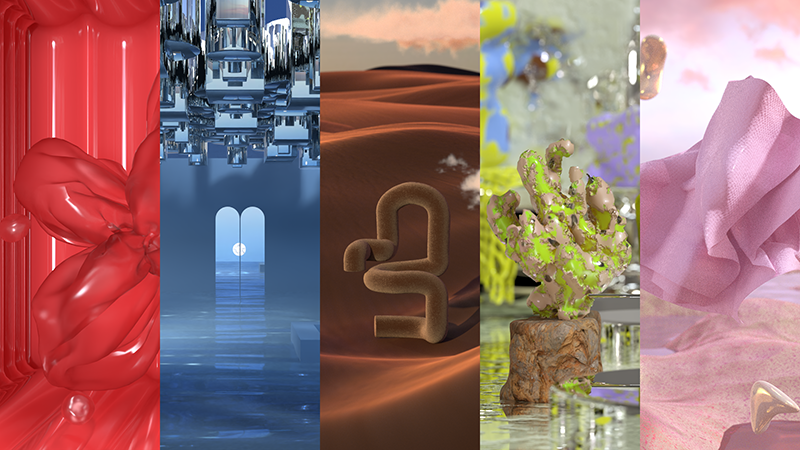
Smith described the five key hues that traverse effortlessly between digital and physical realms.
Radiant Red

Radiant Red is a stimulating and emotionally engaging color found in a range of virtual environments. On a deeper level, however, this tone connects to the care economy, which emphasizes nurturing people and the planet. Citizens and organizations are recognizing how crucial tending to one another is to personal wellbeing and to our communities at large. “Radiant Red encapsulates this desire for a more caring and loving culture,” Smith explained.
She noted that brands will utilize the vibrant shade to sell beauty products, housewares, and packaging. For Smith, it is a strong tone that has staying power. “Radiant Red has a wonderful playful quality to it. It’s a great summer color but it is also a trans-seasonal bright that continues to gain momentum.”
Elemental Blue

Elemental Blue reflects a desire for a calmer lifestyle. It is a mid-tone hue that Smith said represents the need for balance and moderation. “I think the pandemic really forced a lot of people to slow down, reevaluate, and rest. She described this blue as industrial or low-key in appearance, appealing because it fosters a feeling of safety.
“It feels a bit more restrained in the metaverse environment, but it is a stable color that I think has flex across multiple product categories.” From wallcoverings to paint and decorative accessories, this blue tint is suitable for residential and commercial interiors. “Elemental Blue brings in a bit of a minimalist aesthetic, which I think people are responding to,” Smith added.
Nutshell

A rich and spicy brown, Nutshell is a color that evokes warmth and reassurance. This tint is inspired by the growing thrift and resale culture. As people now value sustainability over newness, this brown will resonate. “There’s a focus on authenticity and craftsmanship,” Smith said. “People want to understand where a product comes from and how it is made, but they also want to know that it is going to last.”
Nutshell is an important color for classic and investment pieces, whether they are fashions or furnishings. It can also be used to give directional styles gravitas, which ensures crossover appeal in every sector. Smith said its inherent tactility and dimension make it perfect for textiles. “Nutshell works really well on a natural fabric or a synthetic material. This retro-inspired brown just has so much range.”
Cyber Lime
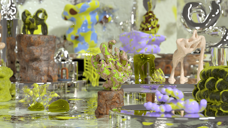
Cyber Lime is a near-neon, a green that signifies the powerful connection between nature and technology, “Cyber Lime is all about energizing the body and the mind. It references the digital and the organic, and it’s interesting to see this interplay. I think this is a color that will be used to make an impact in commercial spaces,” Smith noted.
Not as overpowering as traditional neon hues can be, Cyber Lime is surprisingly versatile, applied as an accent or statement solid on fitness apparel, outdoor products, footwear, and accessories. Smith said this tone complements virtual settings. “It’s a punchy green, but it is usable. This color is definitely about creating spaces that will also engage on digital platforms and easily move into the metaverse as well.”
Fondant Pink
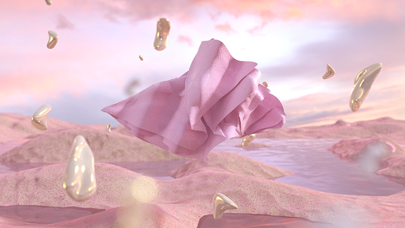
A pigmented pastel, Fondant Pink signals the return of sweet, mellow shades that blend effortlessly with lilac and lavender tones. This hue connects consumers to feelings of delight, and creates small moments of wonder as we move through spaces. It acts as an antidote to anxiety, enhancing wellbeing and slowing down our perception of time. “Fondant Pink has a refreshing quality. It’s a color that leaves people feeling inspired, especially after this time of fragmentation,” Smith noted.
Generation Z in particular favors this gender-inclusive tone, moving it into the metaverse. Digital gamescapes will be dotted with this pink, and Smith predicts that it will be a social media standout. “I think it will be a great Instagram color. Pink is just completely taking over the market, the rise in this color group has been huge.”
