
Sherwin-Williams announces Colormix Forecast for 2021


![]()
Rhythm of Color: The Story of Balance in Design for 2021
Take a journey from the past into the future with Sherwin-Williams Colormix® Forecast
Sherwin-Williams is announcing its annual Colormix® Forecast, a collection of 40 hues across four palettes that celebrate the Rhythm of Color – the balance between fast and slow, quiet and expressive, and virtual and physical. The forecast is designed to bring the pulse of color to any space: Sanctuary, Encounter, Continuum and Tapestry.
“We started telling a story last year about using color to help us feel grounded as we were headed into a new decade. Now we are continuing that inward journey by exploring the past, examining the present and looking at what this all means for our future,” said Sue Wadden, director of color marketing at Sherwin-Williams. “The rhythm of color is examining where we’ve been to help inform where we’re going and to help us create that central hub that is so vital to our everyday living and working now.”
Wadden and the Global Forecast Team of color professionals at Sherwin-Williams spent time researching color, design and pop culture trends across the globe. They held a workshop to discuss and debate their research, leading to the final forecast of bright and bold blues, muddy greens, muted reds, bright pinks and warm whites.
Colormix Forecast 2021 Collections
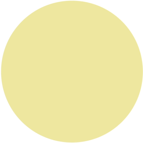
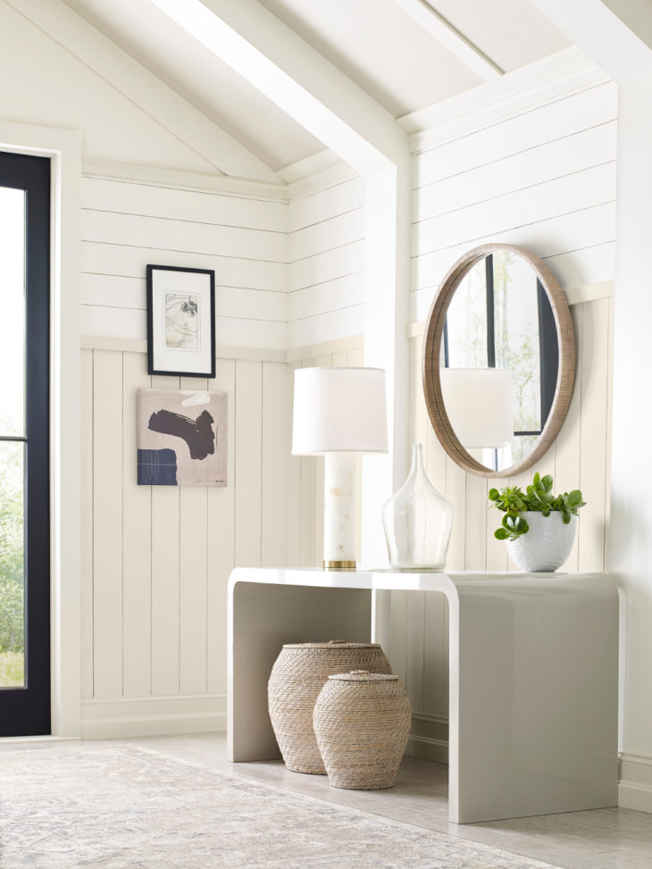 Sanctuary
Rooted in the idea of nature, Sanctuary focuses on the connection that the natural world has to nurturing wellness and calm. This palette is influenced by biophilia, nesting and Scandinavian design. The quietness of Pure White SW 7005 is a signal to take respite, slow down and embrace what’s truly important. The warm minimalism of Morris Room Grey SW 0037 is a reminder that less is more.
Bona Fide Beige SW 6065
Pearl Gray SW 0052
Morris Room Grey SW 0037
Pure White SW 7005
Oakmoss SW 6180
Antiquarian Brown SW 0045
Canyon Clay SW 6054
Modern Gray SW 7632
Messenger Bag SW 7740
Urbane Bronze SW 7048
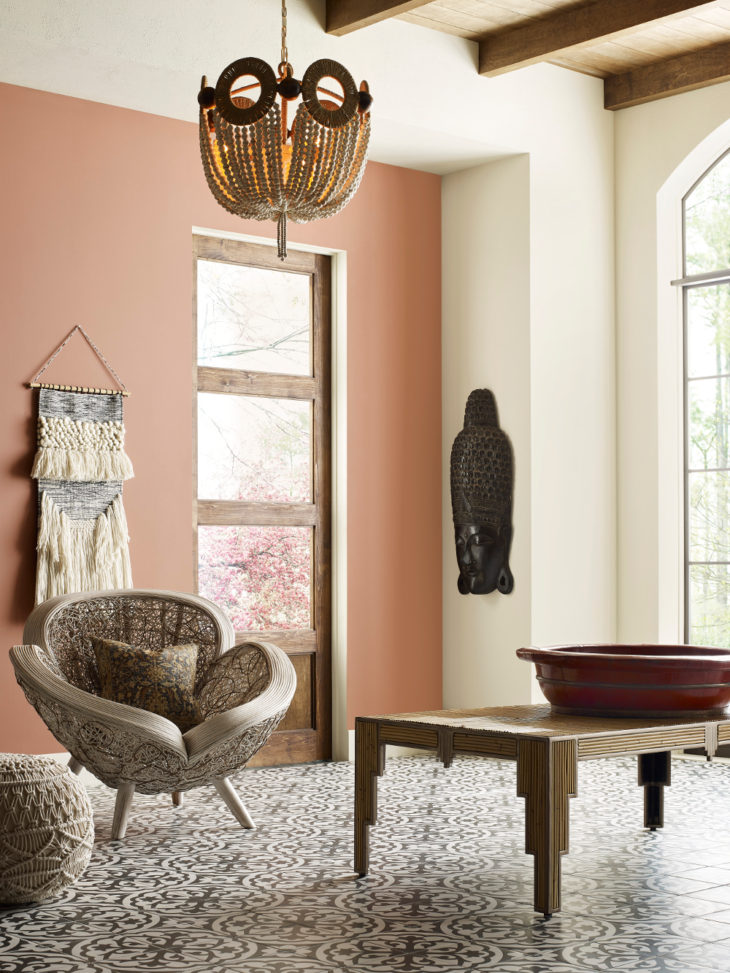 Encounter
Defined by heirlooms and the stories behind them, the Encounter palette is complete with special meaning and rich texture. Hyperlocal connection and storytelling, a modern bohemian aesthetic and natural materials complement the earthy tones, like Rosemary SW 6187 and Reddened Earth SW 6053, that round out this palette. These colors take visual cues from the past’s humble beginnings, speak to the present and guide the path forward.

Alabaster SW 7008
Reddened Earth SW 6053
Blustery Sky SW 9140
Hardware SW 6172
Tarnished Trumpet SW 9026
Java SW 6090
Natural Tan SW 7567
Jubilee SW 6248
Naval SW 6244
Rosemary SW 6187
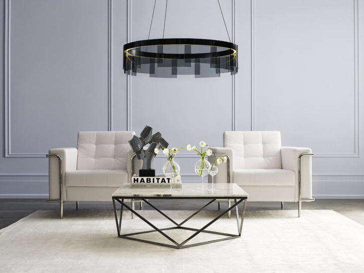 Continuum
The Continuum palette tells the story of smart living and how technology ties into how people live and the desire for it to blend seamlessly into the whites, charcoals and pops of color in everyday environments. The palette takes its cues from the hybrid of synthetic and natural, sea and space, and sculptural modernism and minimalism. It features bright, forward-thinking colors such as Novel Lilac SW 6836 and inky hues such as Commodore SW 6524.
Limón Fresco SW 9030
Wishful Blue SW 6813
Commodore SW 6524
Swimming SW 6764
Great Falls SW 6495
Novel Lilac SW 6836
High Reflective White SW 7757
Cyberspace SW 7076
Crushed Ice SW 7647
Moonraker SW 6701
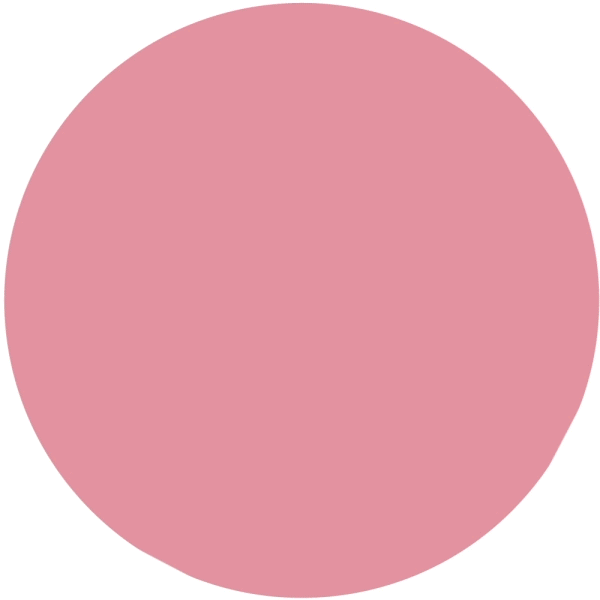
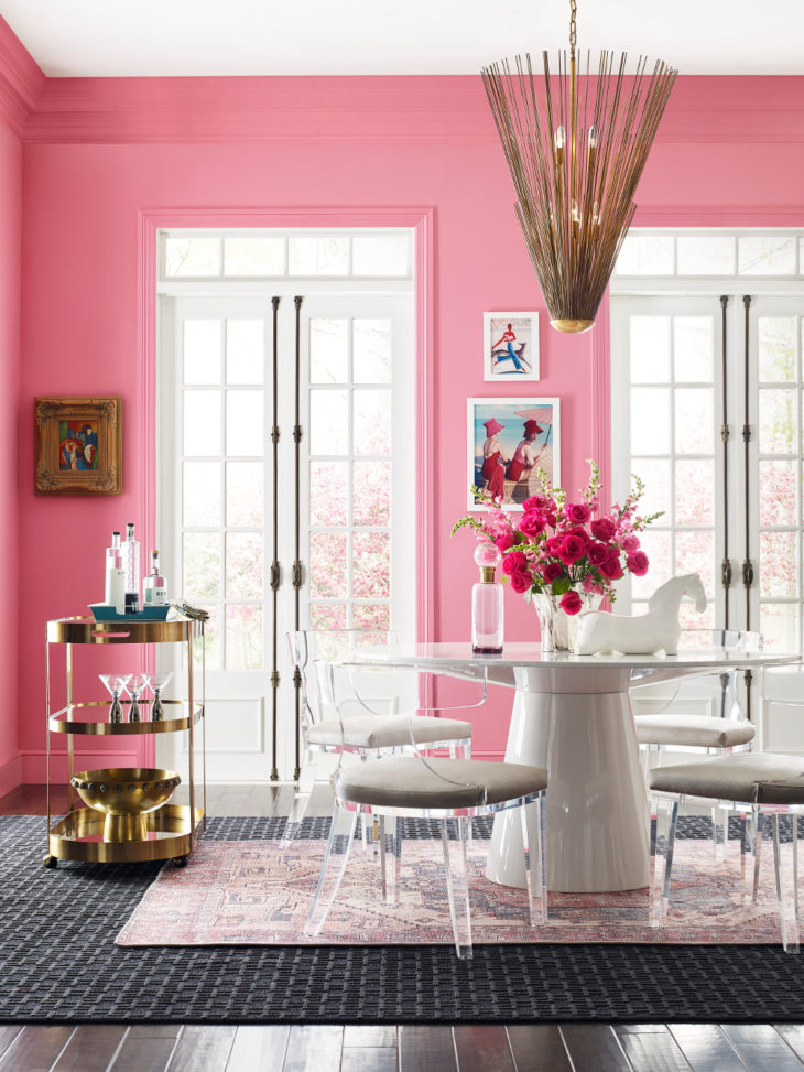 Tapestry
Creative expression is a top influence on the Tapestry palette. The happy and modern hues are meant to signal joy and layer together to tell a story through texture and pattern. Additional influences, such as security, reinvented classics and sensory exploration, can be found in standout, vibrant colors like Jaipur Pink SW 6577, Alexandrite SW 0060 and Perfect Periwinkle SW 9065.
Greek Villa SW 7551
Aleutian SW 6241
Enjoyable Yellow SW 6666
Alexandrite SW 0060
Jovial SW 6611
Perfect Periwinkle SW 9065
Tricorn Black SW 6258
Cape Verde SW 6482
Jaipur Pink SW 6577
Embellished Blue SW 6749
Color Exploration and Selection
Explore the Colormix Forecast 2021 with the ColorSnap® Visualizer app, a tool designed to help consumers and professionals make confident and smart paint color selections. Download the app to try out Sherwin-Williams 1,700 hues in your own space in real time with the app’s Instant Paint augmented reality tool.
All the colors in the Colormix Forecast 2021 are available at Sherwin-Williams stores nationwide and are available to order online for pick-up. Learn more about Sherwin-Williams Colormix Forecast 2021 and other color selection resources at www.swcolormix.com.
Ask Sherwin-Williams™
For more than 150 years, Sherwin-Williams has been an industry leader in the development of technologically advanced paint and coatings. As the nation’s largest specialty retailer of paint and painting supplies, Sherwin-Williams is dedicated to supporting both do-it-yourselfers and painting professionals with exceptional and exclusive products, resources to make confident color selections and expert, personalized service at its more than 4,400 neighborhood stores across North America. For more information, visit sherwin-williams.com. Join Sherwin-Williams on Facebook, Twitter, Pinterest and Instagram.


